Design Process
Hypothetical Moët hennessy north america
spirit & Stars Award Rebrand
Everyone approaches design in their own way. This is not only how I approach working with established brands but also how I evaluate and draft logos in a fresh branding project whether reviewing my own work during a project or the work of a colleague.
I begin by diagnosing what is working and what isn’t while attempting to understand the motive behind the design choices. From that initial diagnosis I tend to make lists to keep things organized. This is part of what I often refer to as building the sandbox. By understanding and accounting for hard parameters such as typefaces, color palettes, graphic elements, and destination display spaces, I establish the four sides of the sandbox. Only when you have four walls can you dump in the sand and start making castles, and this is when the exploration and design phase begins.
I find this approach to be invaluable in keeping a project focused by balancing concepts and iterations against the challenges a logo is intended to solve for so that it communicates to its intended audience effectively while representing the brand authentically. It has proven itself to be an effective method to plan and execute projects as it helps to remove personal attachment to a design that may be good or interesting on its own but not necessarily be an appropriate appropriate solve for the brand.
Below is an exercise I completed to better illustrate this sandbox approach.
Existing Logo
Pain Points & Solutions
1. Overall Direction: The original design employs competing textures, varied type sizes, off-brand stars, and a mixture of symmetry an asymmetry.
Solution: Consider the luxury market and its use of restraint and minimalism. This market is often typified by a ‘quiet wealth’ approach to design, letting materials speak for themselves, and using graphic elements to punctuate the design. The original would be helped greatly by toning down an balancing the existing elements and applying a stronger hierarchy.
2. Vertical Spacing: The distance between words reduces readability and fails to establish hierarchy.
Solution: Tighten up leading to better relate "Spirit & Stars Awards”. Spacing between award name and brand name could be reduced slightly.
3. Typography: Trying to create a rectangular typographic layout by adjusting tracking on each word drastically reduces readability, especially in the case of "awards" which recedes in the layout due to the amount of white space around the characters. Forcing a rigid structure to the lockup in this instance is also creating a drift on the right side due to the S characters being metrically lined up with the T instead optically. The ampersand being treated with a transparency makes it the last character/word to be read in the layout.
Solution: Explore font choices that work better with the MoëtHennesy brand and work well at all sizes with social media in mind as well as printed event collateral. Use the minimal spacing adjustments and look for interesting letter relationships rather than forcing the type to fit a shape. Establish a stronger hierarchy between “Spirit & Stars” and “Awards”
4. Graphic Elements: The stars appear to be tacked on as an afterthought and do not relate well to the rest of the logo. They also force an otherwise symmetrical logo to become asymmetrical which creates an unbalanced feeling the the composition.
Solution: Literal graphic stars may be redundant if the type reads clearly and immediately. If included, stars should relate better to the brand and how they employ deploy the mark, often used sparingly for more impact. Utilizing a container may better solve for the apparent original intention of a geometric lockup.
5. Layout: The margins around the logo are inconsistent on all sides. The original would suffer as a social media profile picture and would be difficult to balance into a square format for in-feed promotion.
Solution: Attempt a symmetrical layout if possible especially considering application across social media. Balance and legibility is more important than the silhouette of the lockup. Keeping in mind there may be an event component to the brand, account for the legibility of printed products across a variety of touch points both print and digital.
Inspiration
Logo
Option A
The full color version utilizes the same gold foil texture for the background, gold hairline, and star,
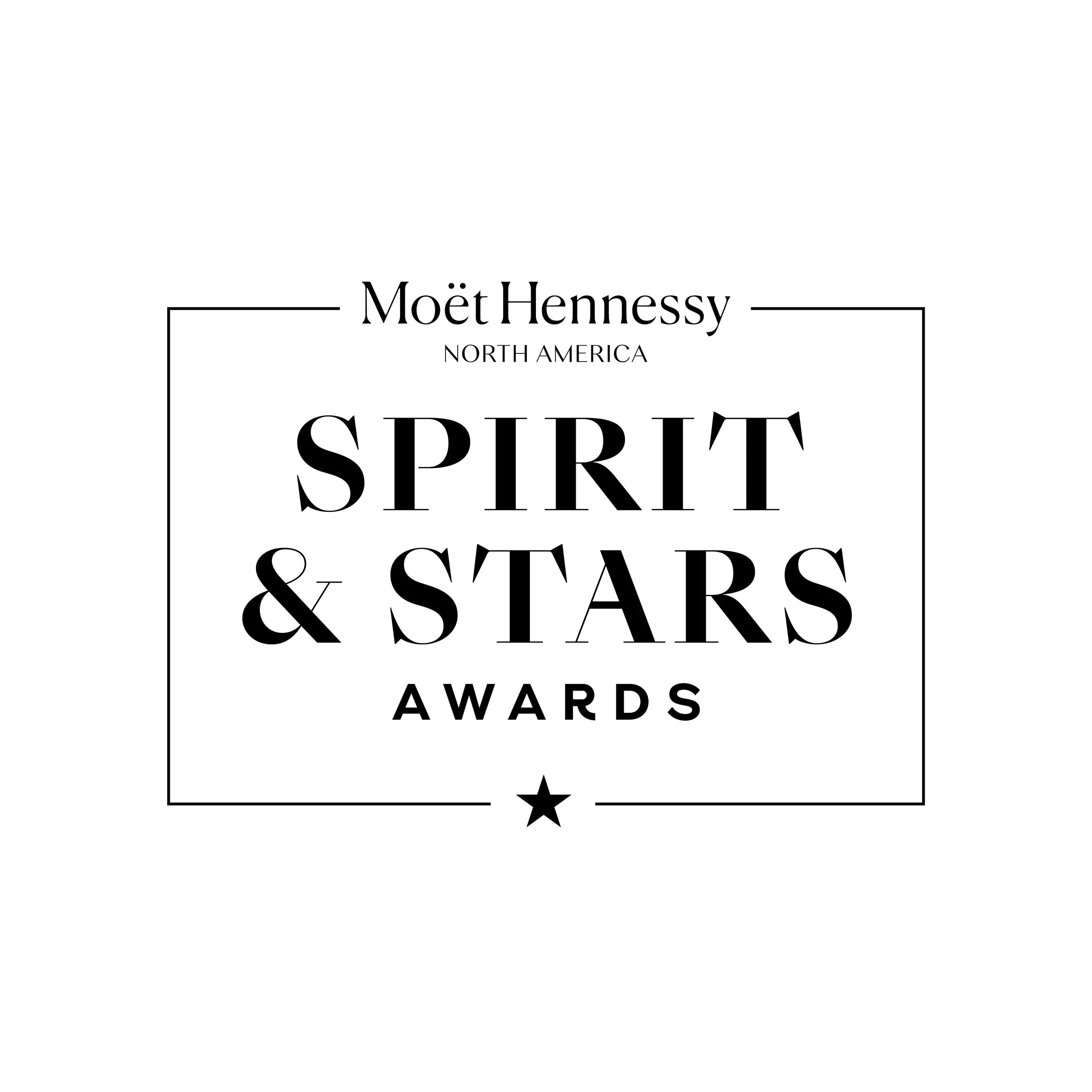
unifying these elements within the design. "Spirit & Stars" reads quickly in a typeface that contrasts enough with the MoëtHennessy logo without conflicting with it. The star graphic is better incorporated and serves as punctuation in the design and acts as a callback to the Moët bottleneck design.
Logo
Option B
Using an upper/lowercase approach in tandem with a less severe serif lends a feeling of approachability and familiarity. This version simplifies the logo to the essentials, dropping the graphic star since the word "Stars" is read immediately, and relying on the quick-reading of the award name. The ampersand is highlighted as the standout design feature to stress the team oriented nature of the awards.
Animation


