Hangarfour design task
Moët hennessy north america
spirit & Stars Award Rebrand
Existing Logo
Pain Points & Solutions
1. Vertical Spacing: The distance between words reduces readability and fails to establish hierarchy.
Solution: Tighten up leading to better relate "Spirit & Stars Awards”. Spacing between award name and brand name could be reduced slightly.
2. Typography: Trying to create a square typographic layout by adjusting tracking on each word drastically reduces readability, especially in the case of "awards" which recedes in the layout due to the amount of white space around the characters. The ampersand being treated with a transparency makes it the last character/word to be read in the layout.
Solution: Explore font choices that work better with the MoëtHennesy brand and work well at large sizes. Use the minimal spacing adjustments and look for interesting letter relationships rather than forcing the type to fit a shape.
3. Graphic Elements: The stars appear to be tacked on as an afterthought and do not relate well to the rest of the logo. They also force an otherwise symmetrical logo to become asymmetrical.
Solution: Literal graphic stars may be redundant if the type reads clearly and immediately. If included, stars should relate better to the brand.
4. Layout: The margins around the logo are inconsistent on all sides.
Solution: Attempt a symmetrical layout if possible especially considering application across social media.
Inspiration
Logo
Primary
The full color version utilizes the same gold foil texture for the background, gold hairline, and star,
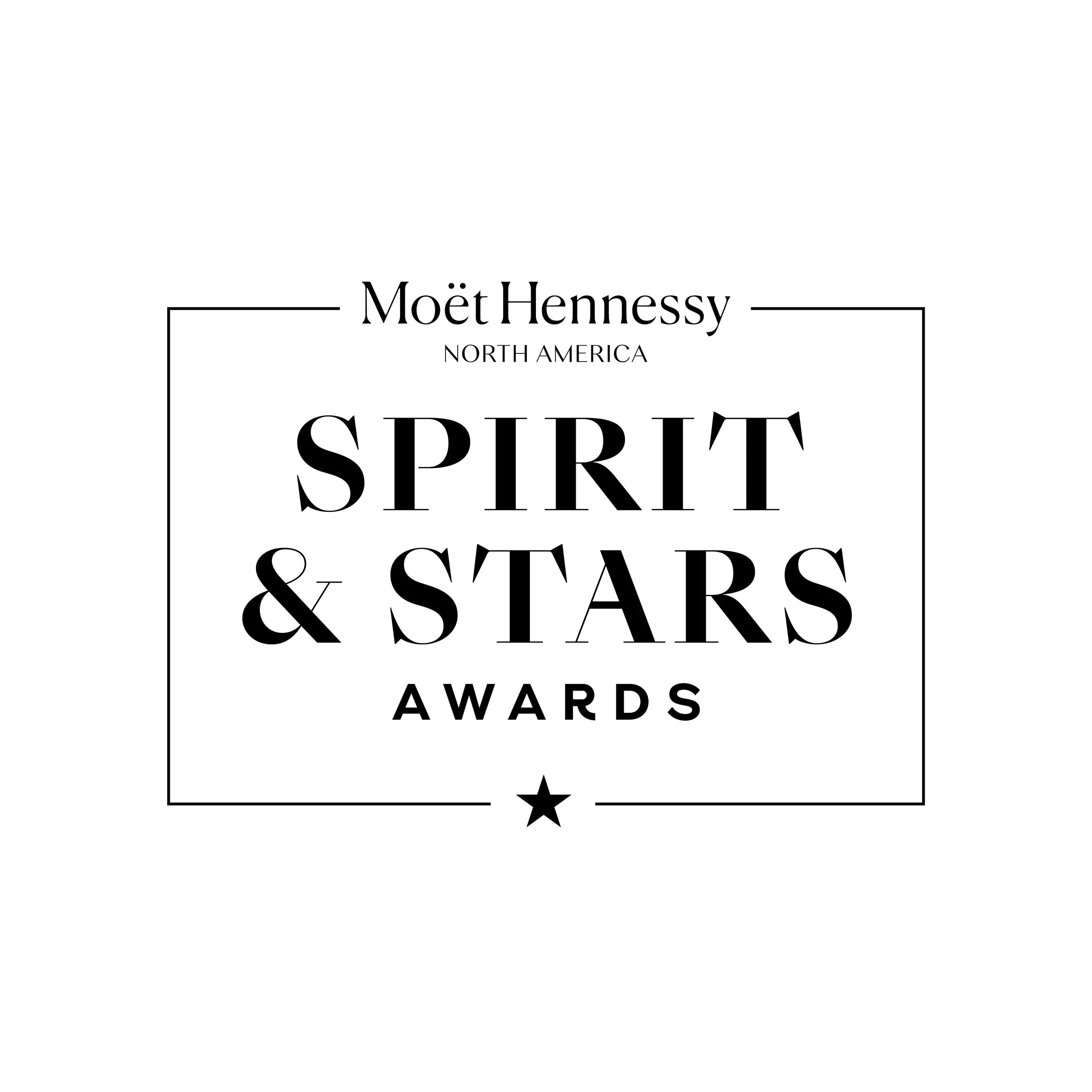
unifying these elements within the design. "Spirit & Stars" reads quickly in a typeface that contrasts enough with the MoëtHennessy logo without conflicting with it. The star graphic is better incorporated and serves as punctuation in the design and acts as a callback to the Moët bottleneck design.
Logo
Secondary
Using an upper/lowercase approach in tandem with a less severe serif lends a feeling of approachability and familiarity. This version simplifies the logo to the essentials, dropping the graphic star since the word "Stars" is read immediately, and relying on the quick-reading of the award name. The ampersand is highlighted as the standout design feature to stress the team oriented nature of the awards.
Animation


