ASBURY PARK BEERFEST
branding / LOGO DESIGN / POSTER DESIGN
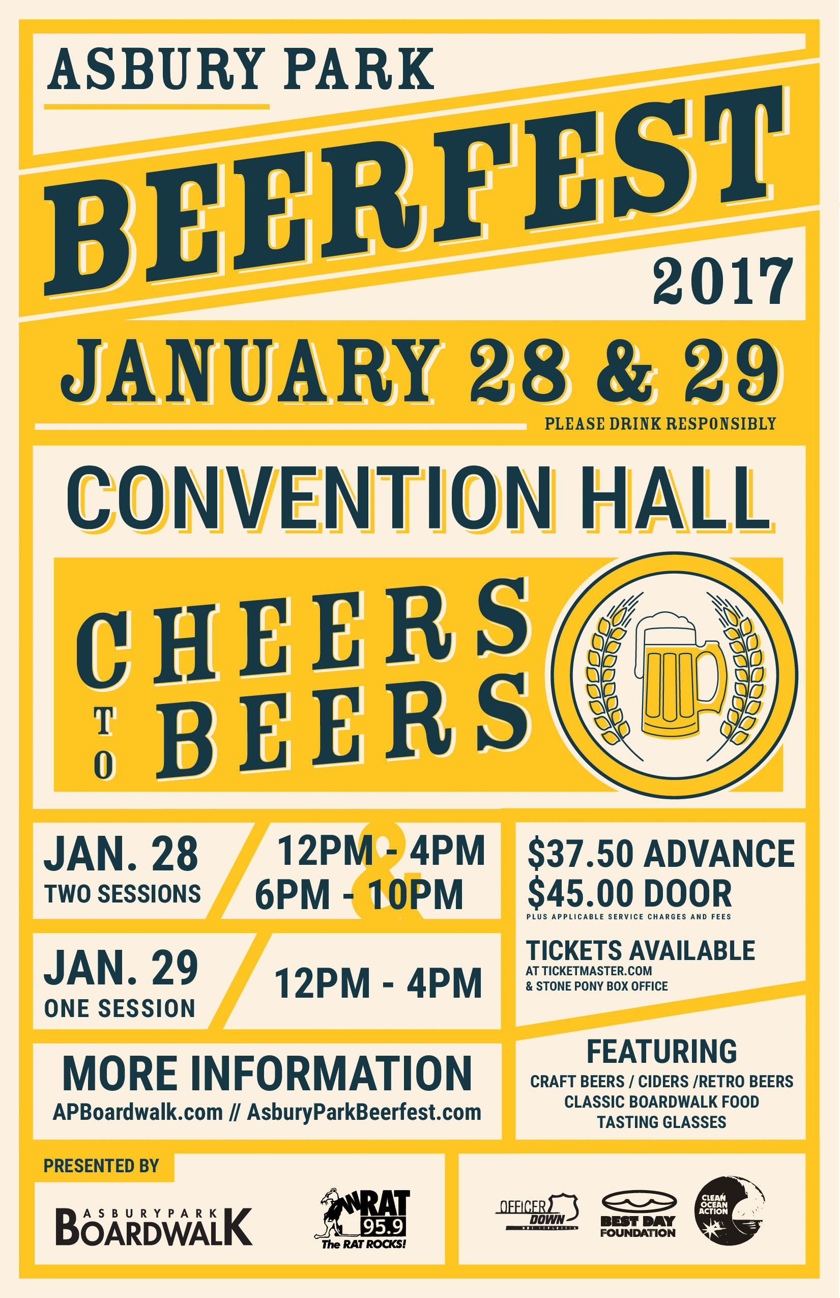
The Asbury Park Beerfest is an annual beer tasting event boasting over 70 vendors and thousands of visitors each winter in Convention Hall. For the 2017 Beerfest I had the opportunity to rebrand the event from its 2012 look. I kept the spirit and traditional look of the event in mind when beginning the process focusing on the retro sensibility of the original poster design. My redesign for the poster featured angular compositions inspired by vintage beer advertising and package design. Where the old logo and poster featured very dramatic woodblock type, I chose a less distracting slab serif, woodblock inspired typeface. I updated the illustrations where possible and removed elements that were distracting from the brand and artwork. Combining a clean sans serif with the woodblock inspired typography helped inject some modernism into the piece allowing for the large amount of copy to be represented clearly as the promotional materials ranged in size from small news paper advertisements to a billboard. Maintaining a consistent color treatment, typography, and angular approach allowed for modular redesigns informed by the destination display format.